Visual identity is often boiled down to the logo — and that's a mistake. A logo is a single element, while a visual identity is a whole system that makes a brand recognizable everywhere: on a website, on packaging, in social media and on a business card. Let's break down what visual identity means in plain terms, which elements it's made of, how it's developed, and how it differs from a logo and a brand. And let's clear up the confusion around the word “identity” right away.
What visual identity is (and where identity comes in)
A visual identity is a single set of visual rules that govern how everything a customer sees is designed. The goal is simple: to make you recognizable at a glance, even without the logo — by your colors, fonts and overall manner.
“Identity” is the same thing, just a term from professional jargon. When designers talk about an “identity,” a “visual identity” or a “brand identity,” they usually mean one and the same thing. So there's no need to be thrown off by the different terms.
Visual identity ≠ logo ≠ brand
Three concepts that get mixed up all the time:
- Logo — a mark. A single element. (More on this in the article on logo design.)
- Visual identity — the system around the logo: colors, fonts, graphics, rules.
- Brand — what people think of you. A visual identity helps you build and lock in that impression. (See what branding is.)
Roughly speaking: the logo is the face, the visual identity is the entire appearance, and the brand is the reputation.
What a visual identity consists of: the elements
This is the most common question — “what's included in a visual identity.” The basic set is as follows:
The logo and its versions
The main mark plus variants: horizontal, compact, icon, black-and-white. So the identity works everywhere, not just on a white background at a single size.
Color palette
Primary and secondary colors with exact values (for screen and for print). Color is the fastest recognition cue: a brand is often recognized by color before people even read the name.
Typography (fonts)
Which fonts are used for headlines, body text and accents. Consistent typography instantly makes different materials feel like “one family.”
Graphic language
Patterns, shapes, icons, photo and illustration style — everything that creates the brand's recognizable “texture” beyond the logo.
Media
How all of this is applied to real-world things: business cards, letterhead, packaging, website, social media, signage, merch. An identity doesn't exist in a vacuum — it lives on its media.
Tone and rules
How the elements can and can't be used: spacing, combinations, restrictions. Without rules, the system falls apart within a couple of months once it passes through different hands.
Where a visual identity lives: media
An identity is valuable not in itself, but in how it works at touchpoints. The most common media:
- Digital: website, social media, presentations, newsletters, marketplace product cards.
- Print: business cards, letterhead, packaging, labels, flyers.
- Environment: signage, store design, merch, staff uniforms.
A good visual identity is thought through so it lives just as confidently in a tiny avatar as it does on a large sign.
How a visual identity is developed: the stages
1. Analysis and positioning
Who you are, what sets you apart, who your competitors are and how they look. The identity should set you apart, not blend into the market.
2. Concept
The idea and visual direction — a character that then unfolds across all the elements.
3. Logo and core elements
The mark, palette, typography, graphic language.
4. Media
The identity is tried on real things — website, packaging, business card. This is where you check that the system is alive, not just “pretty on a single banner.”
5. Brand book / guidelines
A set of rules that lets anyone use the identity without you. This is exactly where what's allowed and what's not gets locked in.
Identity generators and neural networks
Services and AI tools promise a “visual identity in a minute.” For a quick try or a very early start — why not. But it's important to understand the limits:
- It's a set of pictures, not a system. A generator doesn't know your positioning or your competitors, so there will be no differentiation.
- It's not unique. Anyone can get a similar result — including the competitor next door in your niche.
- No rules and no media. You get files, not a solution you can use for a year without chaos.
So a generator is a fine placeholder at the start, but not a foundation for a brand you're investing money to promote.
How much it costs and what it depends on
The range is wide: “a logo + three colors” and a full-fledged system with media and a brand book are different products. The price depends on depth (just the core elements, or media and rules as well), the number of media items, and the level of the people doing the work. The benchmark isn't the price per picture — it's whether you'll still be able to use the identity on your own a year from now.
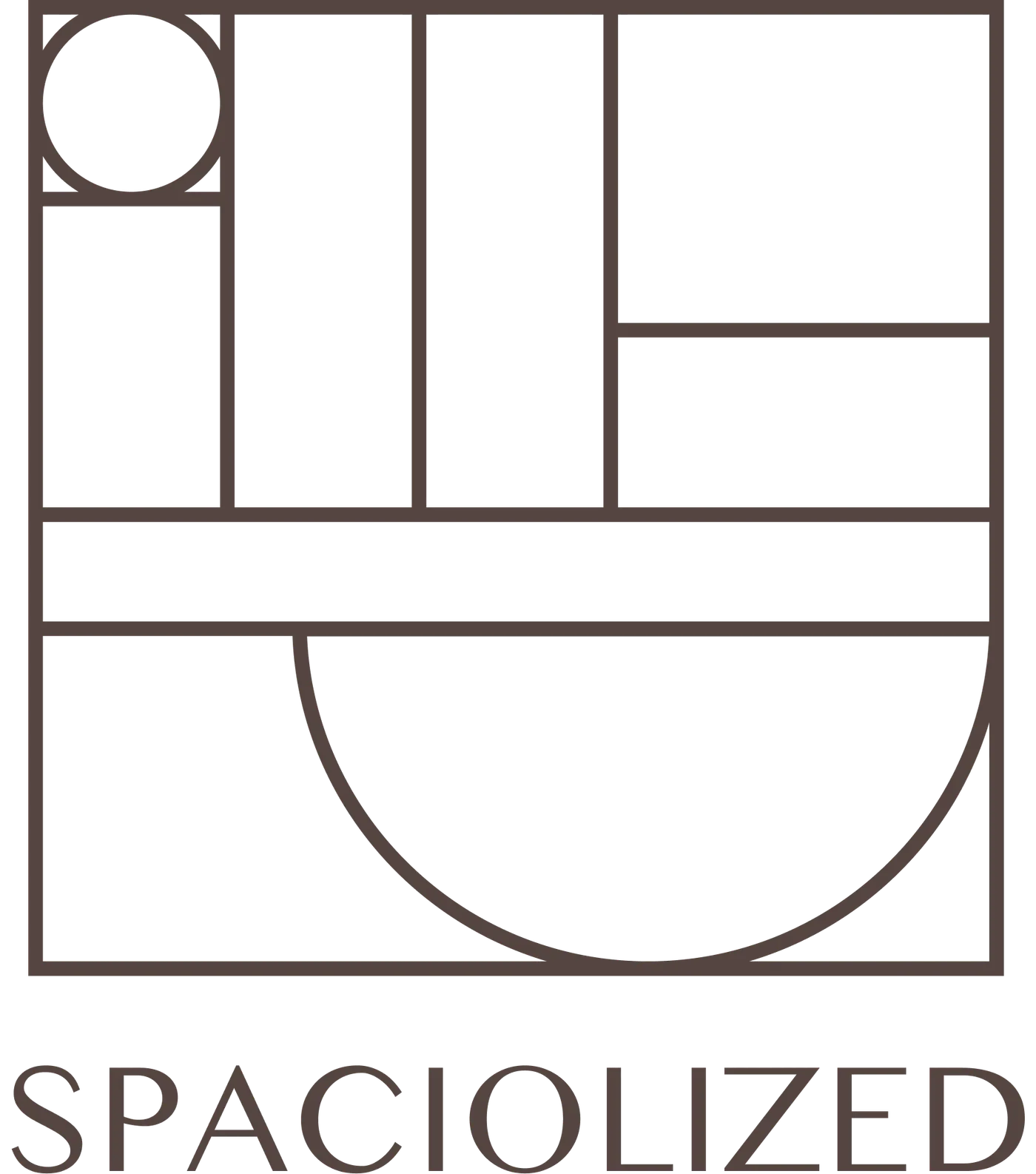 Case in pointSpaciolized Identity — Order as a Systemidentity as a system, not a set of pictures — see the case
Where to start
Not with “design us a prettier identity,” but with “what makes us different and where will people see us.” The answer sets what the identity should be. If you'd like a sober outside look at your current identity or at an idea for a new one — that's free and comes with no obligations.