Brand identity in plain terms
If a brand is what a person thinks about a company, then identity is how that image looks and sounds on the outside. Logo, colors, fonts, patterns, message tone, website and packaging design — all of it comes together into a single system that lets people recognize you before they even finish reading your name. That's why brand identity isn't a "pretty picture" but a tool that helps a company stay recognizable and consistent across every touchpoint.
Two words often get mixed up: branding and identity. Branding is the whole process: strategy, meaning, positioning. Identity is the visual and verbal part of that process — the way strategy becomes visible. You could say identity is the language a brand uses to talk to its audience.
What identity includes: core elements
When people ask what belongs to identity and what its components are, they mean a set of interconnected assets — essentially the same elements that make up a visual style. The basic elements of brand identity are:
- Logo and its variations — the main mark, monochrome versions, an icon for avatars.
- Color palette — brand colors and the rules for combining them. Searches like "identity color" are exactly about this: shades set the mood before words do.
- Fonts and typography — which typeface the identity uses in headlines and body text, how spacing and hierarchy are built.
- Graphic elements — patterns, illustrations, icons, photo style. This is what makes the graphic identity recognizable even without the logo.
- Verbal identity — tone of voice, phrasing, slogans.
On top of this sits the applied layer: identity for the website, product cards, presentations, merch, navigation, advertising. The bigger the business, the more identity assets you have to plan out in advance.
Visual identity and website identity
A brand's visual identity is the most noticeable part of the system: what a person sees in a fraction of a second. On a website it works especially hard. Website identity has to stay consistent with packaging, social media and advertising — otherwise the brand splits into several different companies in the customer's mind.
Product-card identity for marketplaces is a story of its own. Here the visual language has to read at thumbnail size and set you apart from dozens of neighbors in the feed. That's why, when developing identity, we immediately test the elements in real formats: 200×200 pixels, stories, banner, label.
Identity styles
The search "identity styles" usually means: "what direction could my brand look in." There really are established directions:
- Minimalism — lots of air, few elements, a bet on typography and color. Works for tech and premium brands.
- Swiss typography — a strict grid, large type, systematic order. The favorite language of corporations and media.
- Retro and vintage — nods to a certain era: kraft, serifs, muted colors. Great for food, coffee shops, local brands with a story.
- Illustrative identity — a brand character or a hand-drawn world. Expensive to maintain, but delivers maximum personality.
- Brutalism and "acid" — deliberately harsh, loud visuals for a young audience and rebel brands.
The catch is that you can't pick a style like wallpaper — "whichever I like more." A working identity style comes out of your positioning and your competitors' shelf: if all your neighbors in the niche are screaming in acid colors, quiet minimalism will set you apart better than the trendiest gradient.
AI identity: where it helps and where it gets in the way
Searches like "AI identity," "identity neural net" and "identity generator" aren't growing by accident. Neural networks speed up the routine: they generate references, pattern options, mockups, draft product cards. That's handy at the start to quickly see the directions.
But AI identity has its limits. A generator doesn't know your strategy, can't tell you apart from competitors and easily produces a result that looks like dozens of others. So AI works well as a designer's assistant, not as a replacement for systematic thinking. A unique, defensible identity is built by a human, based on meaning rather than pretty generation.
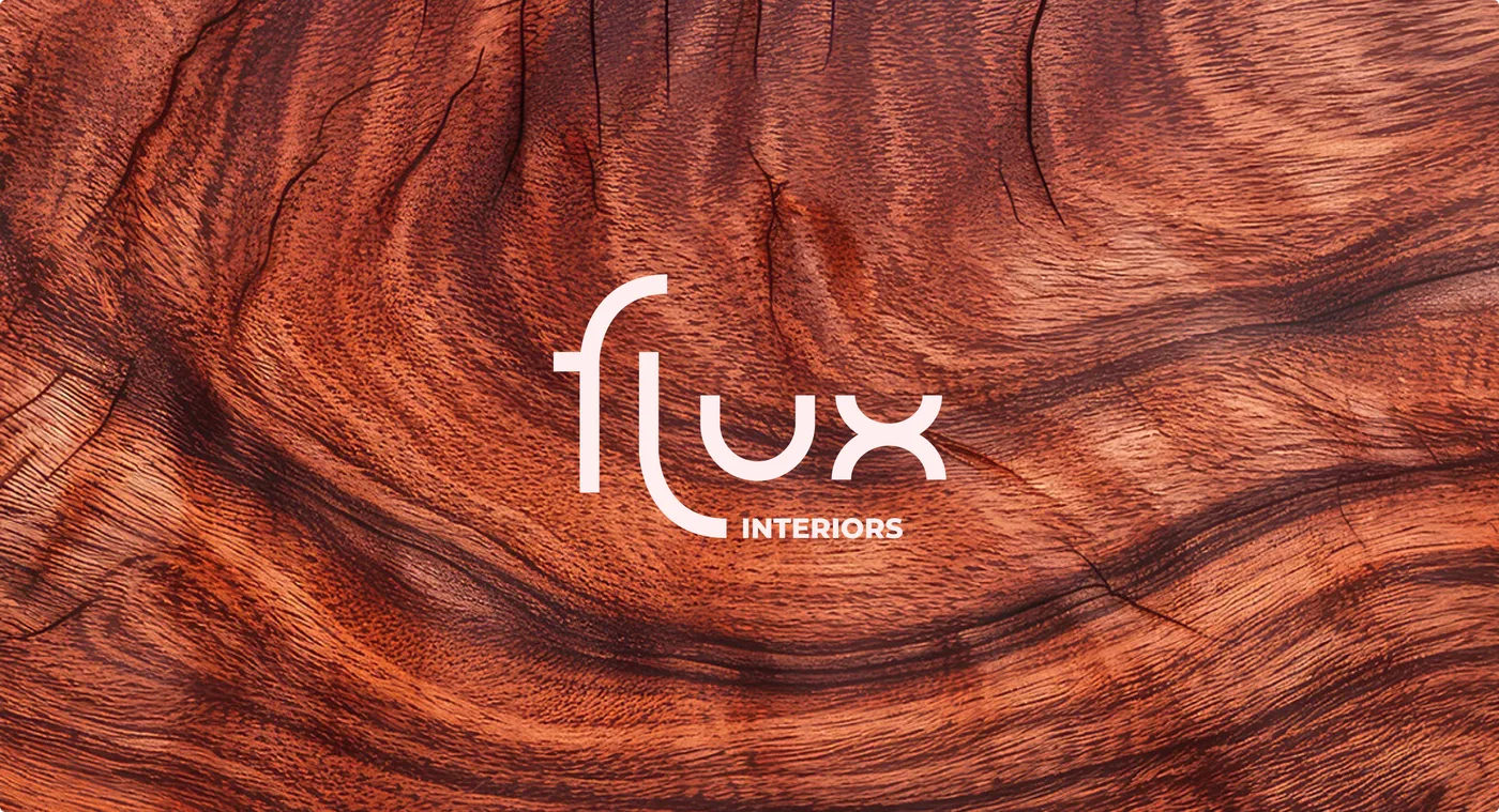 Case in pointFlux Identity — Interior Design Studioan identity built into a flexible system — see the case
How to develop identity: the stages
Creating an identity is built step by step, so the visuals rest on meaning rather than taste:
- Analysis. We study the business, the audience, competitors, the market. Without this, identity turns out random.
- Concept. We formulate the brand's idea and character — what will form the foundation of the visual language.
- Design system. We develop the logo, colors, fonts, patterns, photo style.
- Assets. We apply the system to the website, product cards, packaging, presentations, merch.
- Brand guidelines. We describe the rules of use so the identity can scale without losing recognizability. The expanded version of such a document is a brand book.
How much it costs and who needs it
The cost of developing an identity depends on the scope: a basic set for a small business is cheaper, while a corporate identity with many assets costs more. Free generators and templates cover minimal tasks, but they do a poor job of setting you apart from competitors.
Identity isn't just for big companies. A coffee shop, a dental clinic, a salon, a city festival or a project all benefit equally — it helps them look put-together and inspire trust. If you need brand identity developed for your specific business goals, this is the kind of work where meaning and design have to go hand in hand.