
Logo and identity
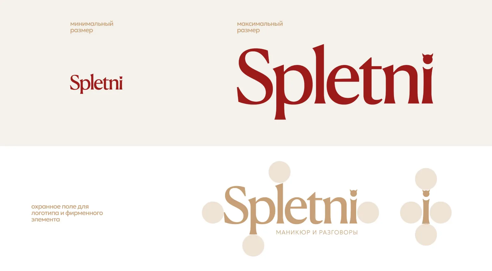
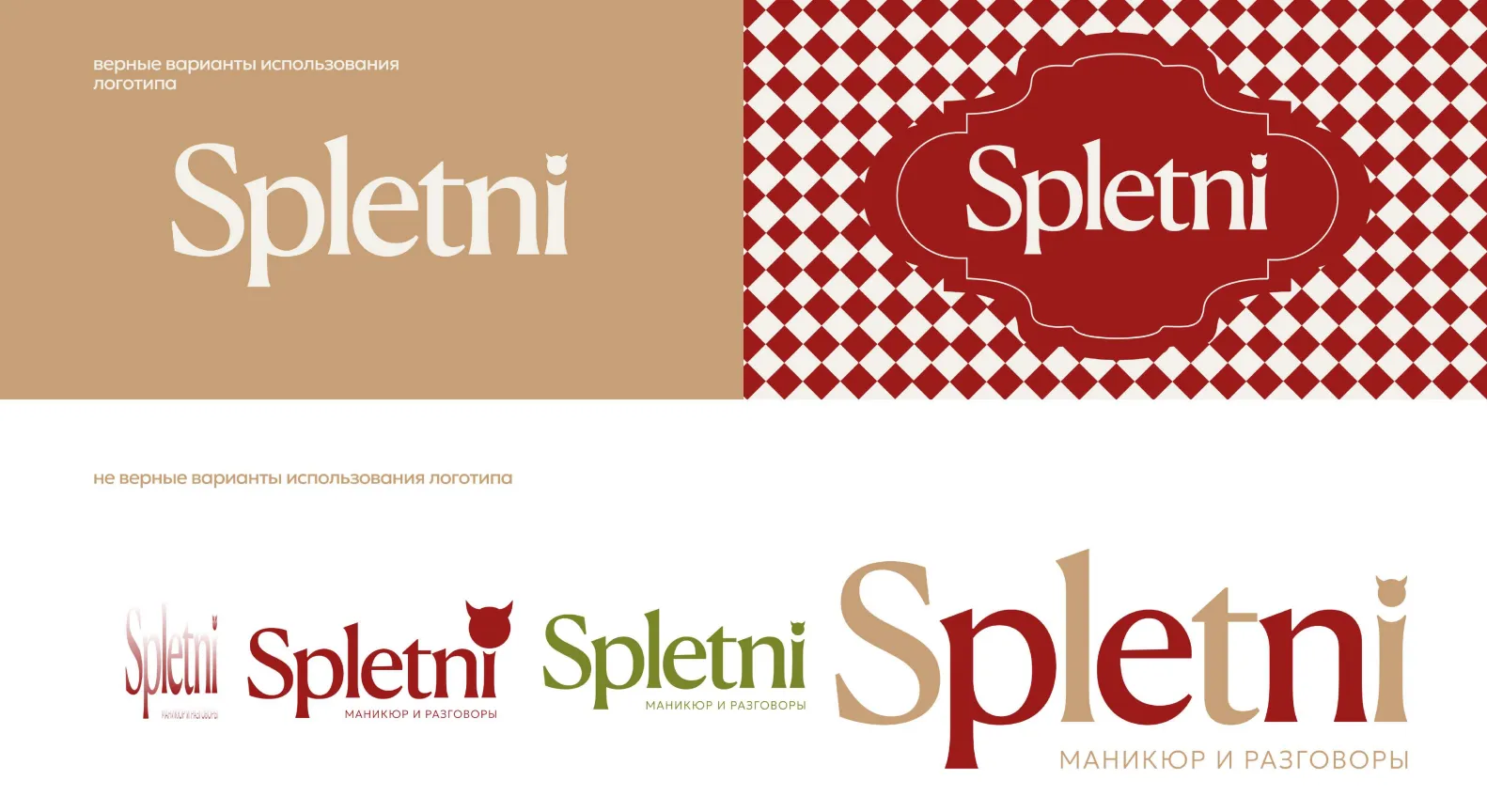
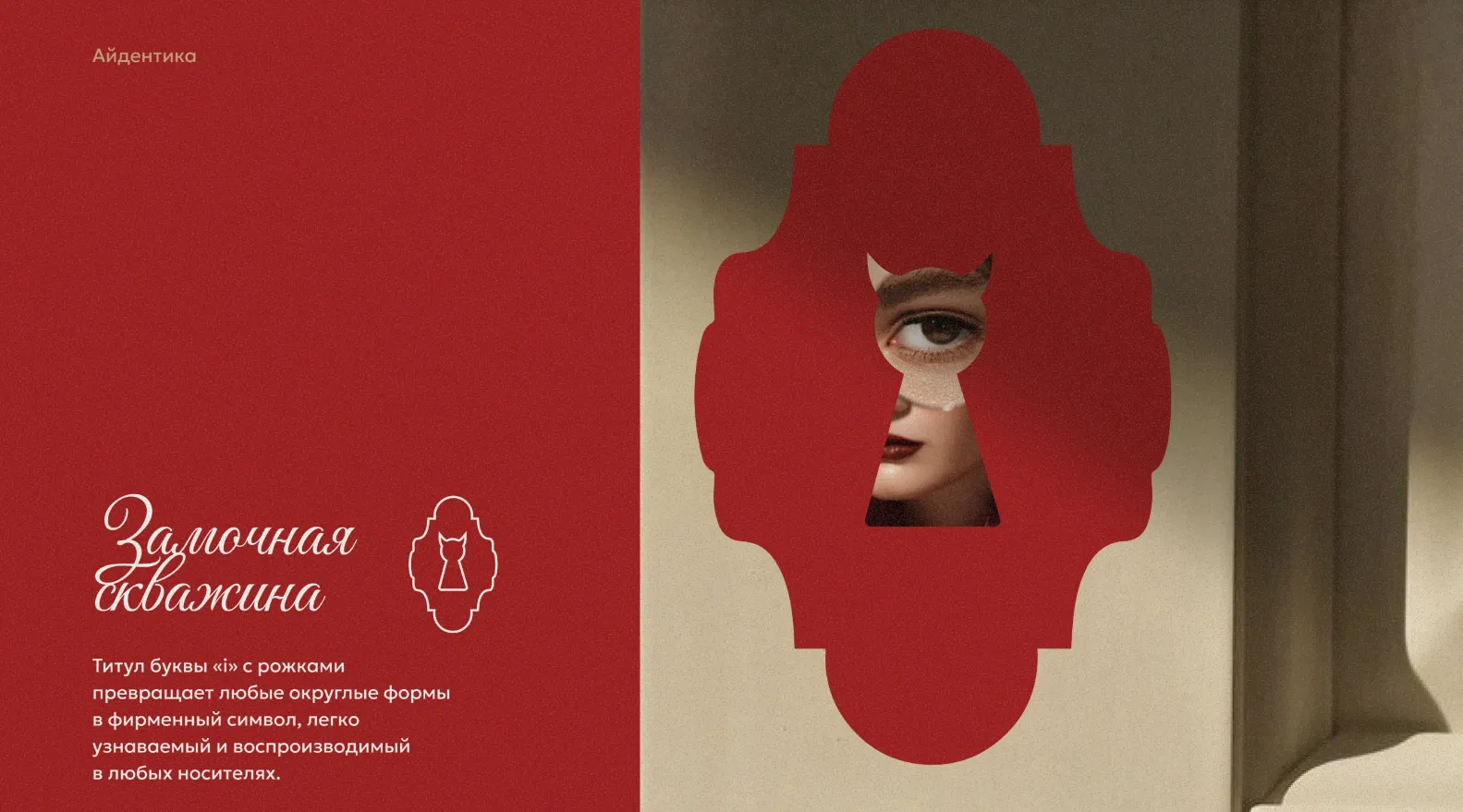
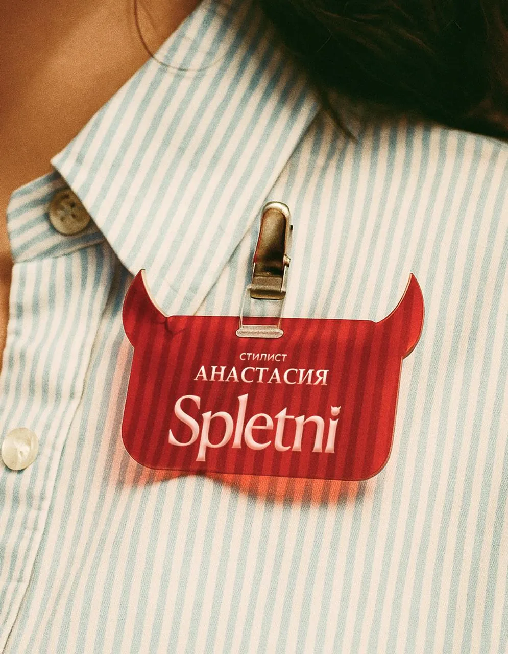
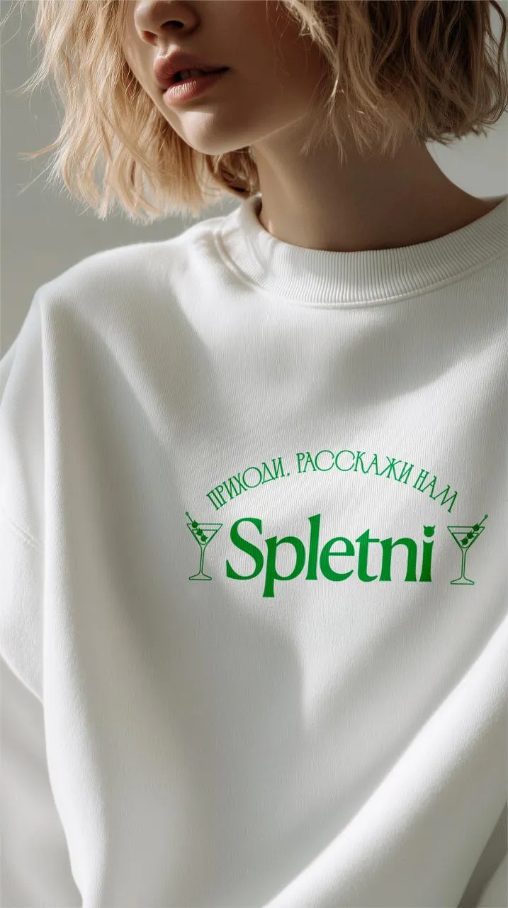
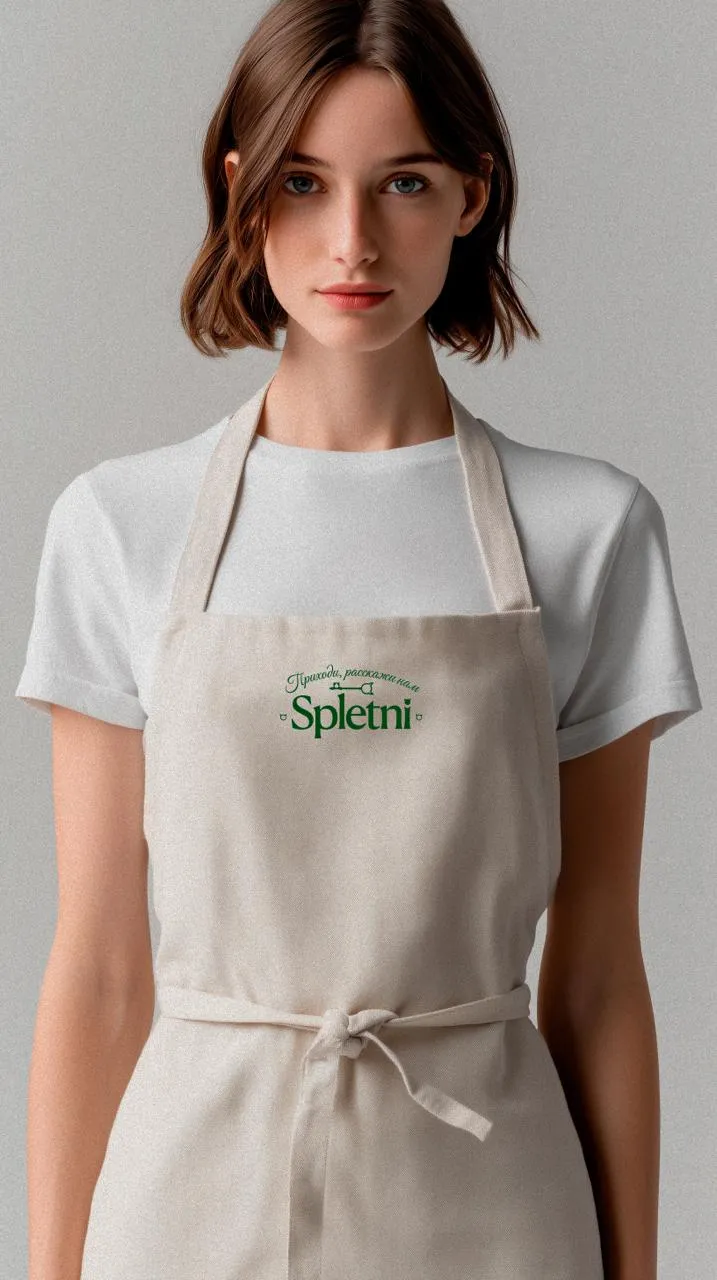
We designed the SPLETNI logo with a signature title on the letter “i” — little horns that turn any rounded shapes into a recognisable symbol. We defined the sizing, clear space and correct usage.
Branding
The client wanted a beauty brand that doesn't look like yet another sterile salon. We built a members-only club with its own culture, where a manicure is an excuse to meet and talk.

Client
SPLETNI is a beauty club built on Old Money aesthetics and the atmosphere of exclusive private clubs. The whole project starts from the name itself: here “spletni” (gossip) isn't about rumours — it's about what happens between your own people: conversations, trust, personal stories and little rituals.
The format is a club with its own culture, where beauty becomes a reason to meet, and the mood and the conversations are as much a part of the experience as the service itself. Two locations: Rostokino metro and Novokosino metro.
We needed a visual language that reads as a private club rather than a beauty service. The name set the tone — and the identity and graphic system grew out of it.
The key nuance: don't slip into a literal “beauty salon” and don't make yet another visually sterile beauty brand. The brand had to feel exclusive, atmospheric and like it belongs to you.
— Gallery



— ABD's role
We built the brand end to end — from the logo and graphics to how the identity lives inside the space itself.
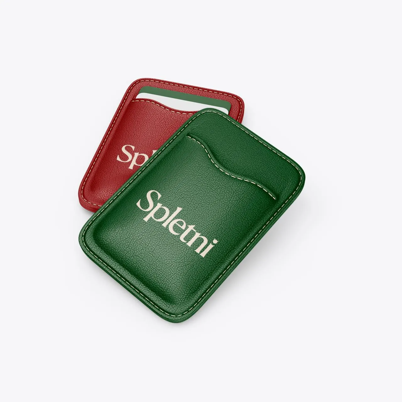
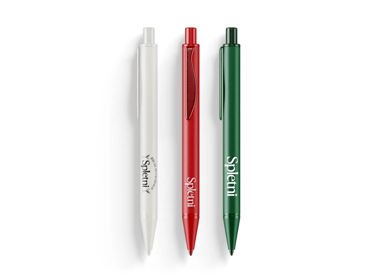
We designed the SPLETNI logo with a signature title on the letter “i” — little horns that turn any rounded shapes into a recognisable symbol. We defined the sizing, clear space and correct usage.
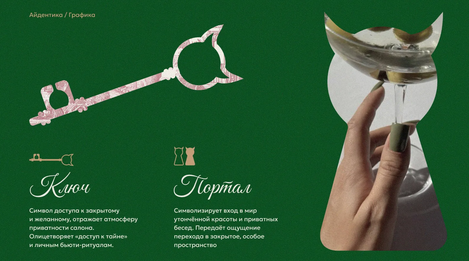
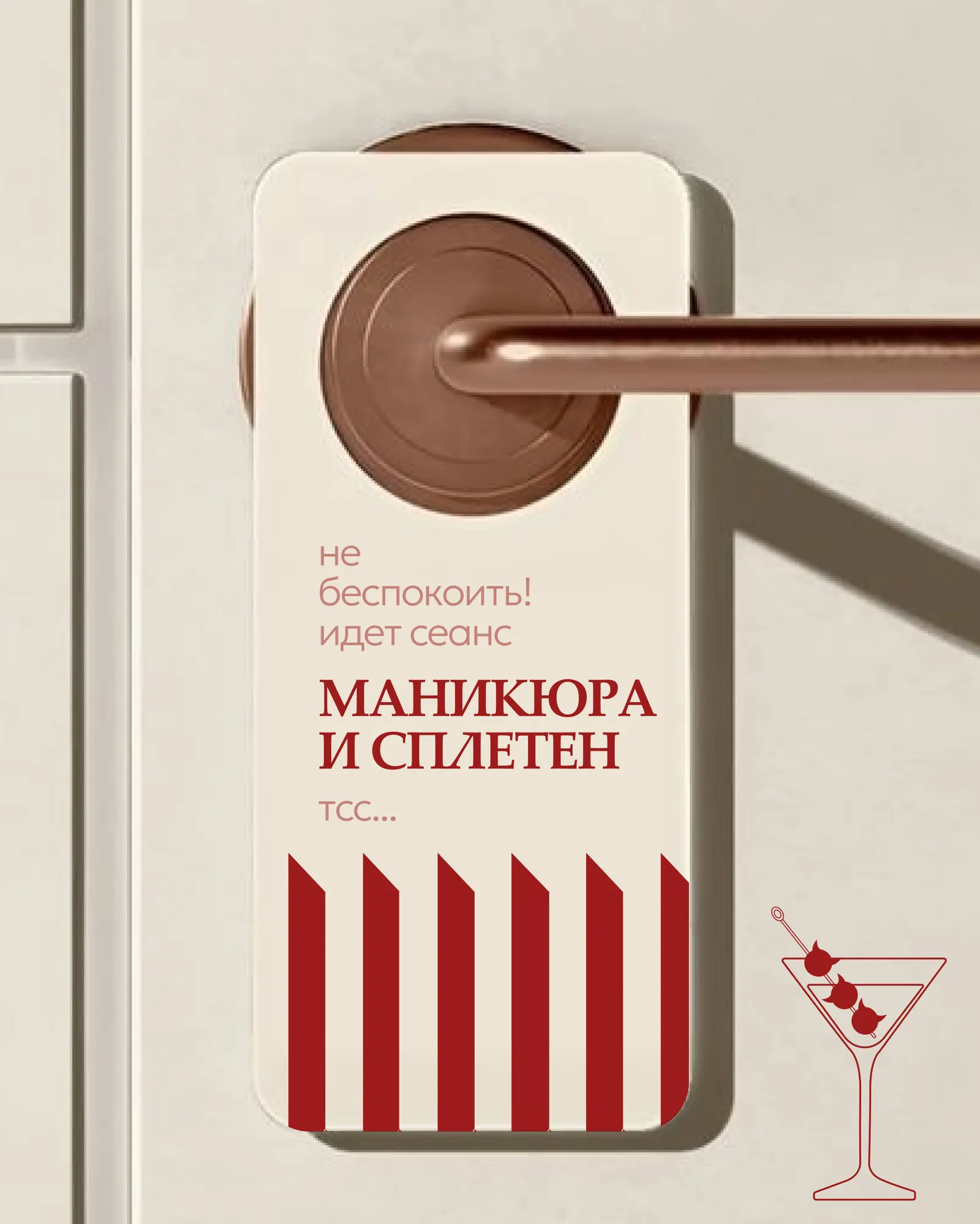
We built the graphics around a private-club aesthetic: the “Key” symbol — access to the exclusive and desired — and the “Portal” — an entrance into a world of private conversations and refined beauty.
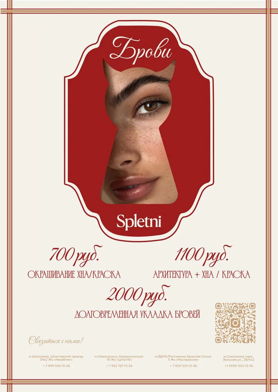
The keyhole shape and the motif of peeking became the conceptual centre — about “access to a secret” and personal beauty rituals, easily reproduced on any medium.
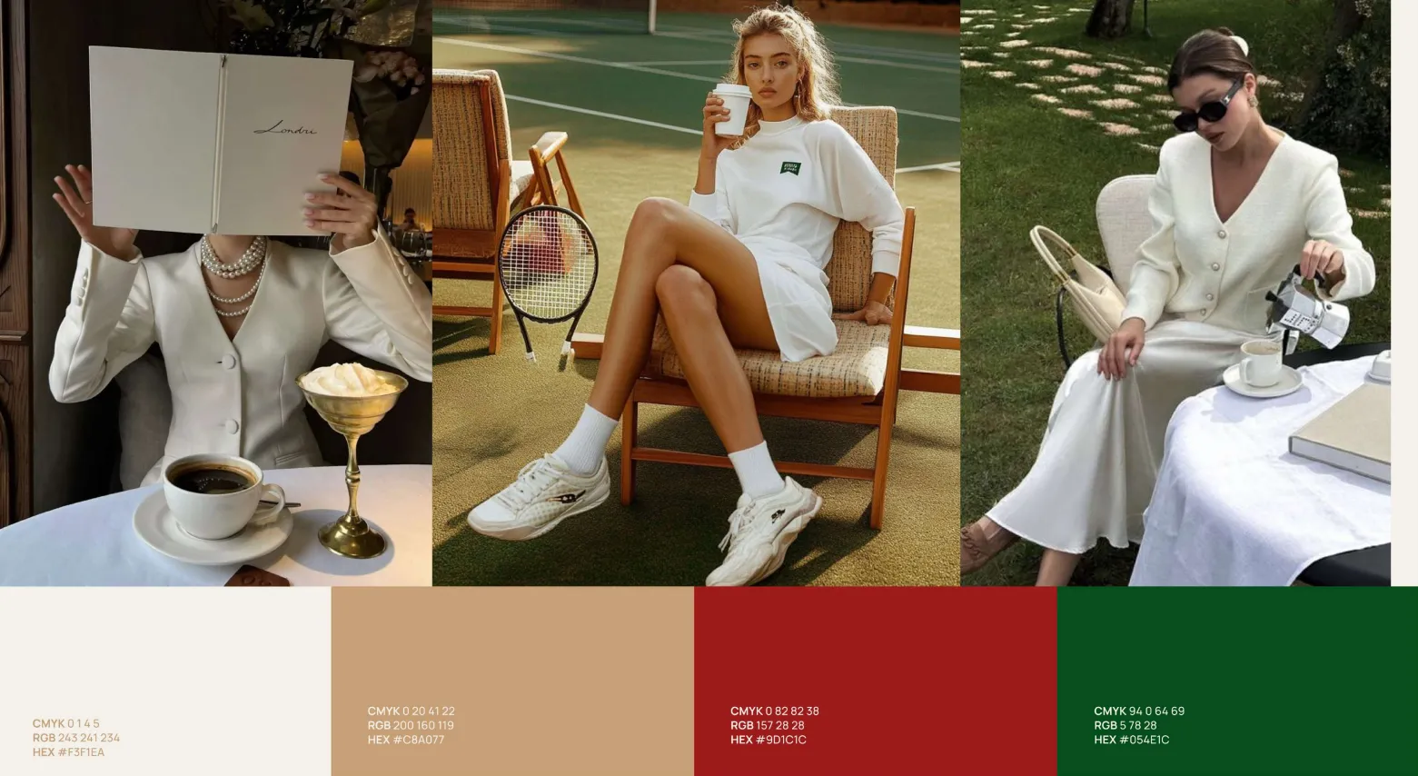
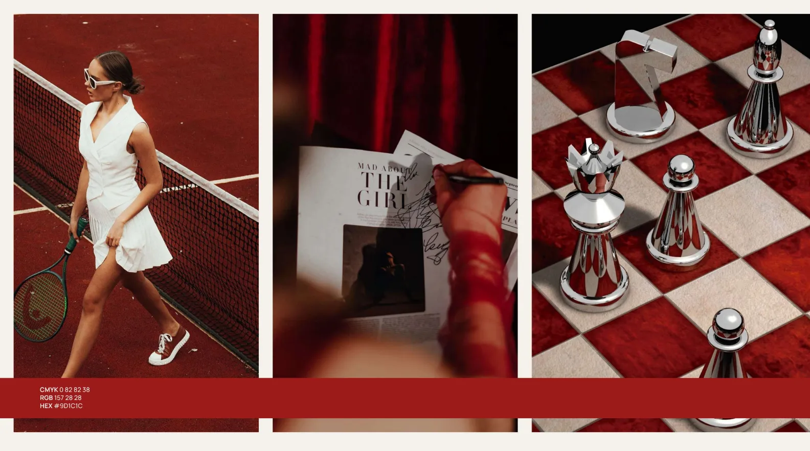
A colour system in milky white, sand, deep red and green; a photo style in the spirit of Old Money — tennis, chess, private interiors.
We carried the style into communications and social media — a unified approach that holds the club's atmosphere rather than advertising services.
We worked out the zoning and how the brand keeps living inside the club: an expressive reception, a logic for functional zones and the entrance design.
— Result
SPLETNI turned out to be a club with its own culture, where beauty is a reason to meet, and conversations and atmosphere become part of the experience. The identity works from the logo and graphics all the way to social media and the space itself.
— Next step · Free consultation
→ Book a slot · Telegram · MAX · Email — whatever's easiest
Telegram@stepan_abd MAXStepan Emailadbydad.agency@gmail.comA short first call — no decks, no fluff. We'll look at your site, social media or packaging, talk through the task and suggest where to start. No obligations on either side.