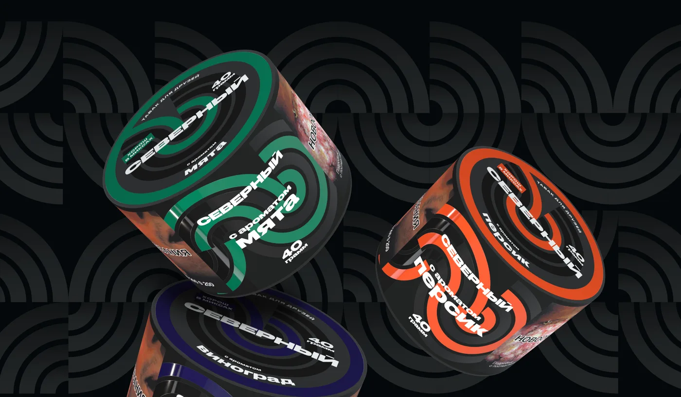
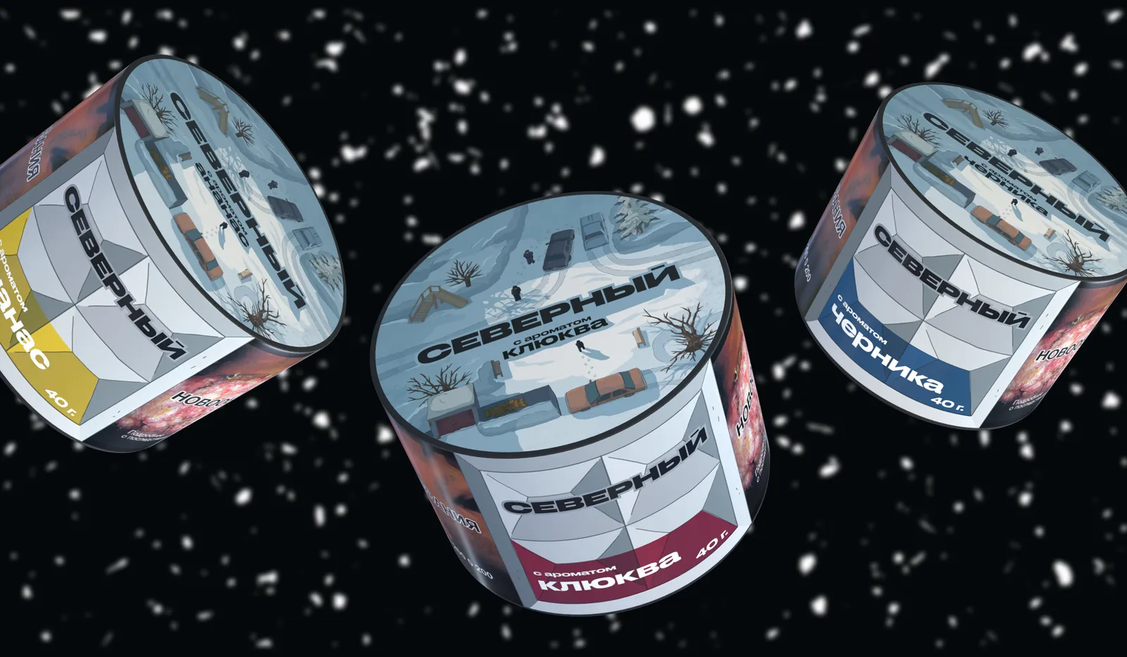
Concept 1 · Illustration
Illustrations with bold character and stylistic weight.
Packaging redesign · Severny
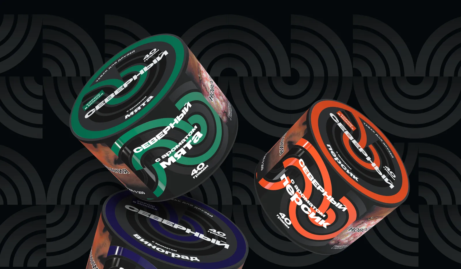
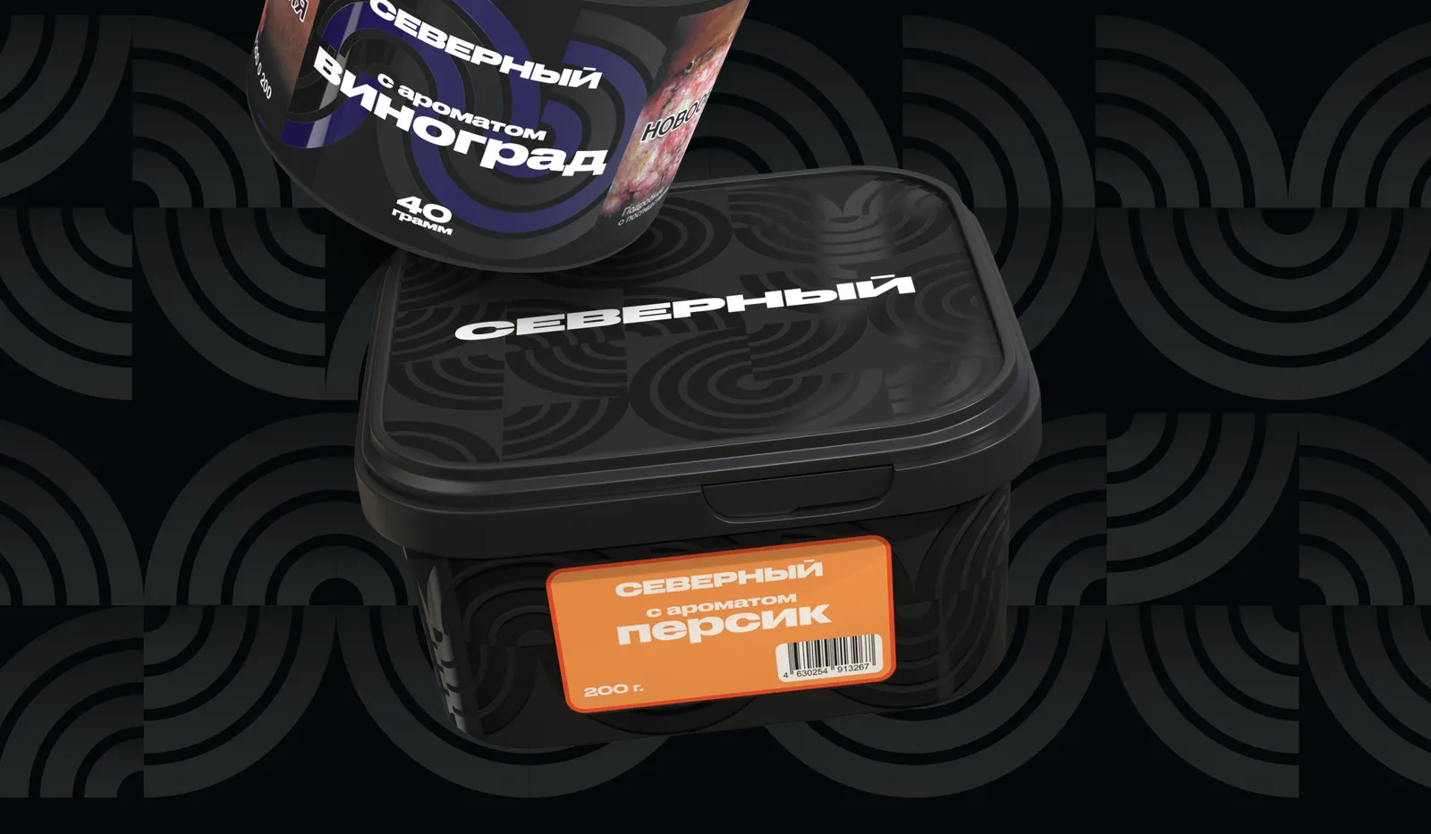
A more unified and mature visual style for Severny packaging — keeping the brand's nostalgia-driven spirit intact. Four concepts to choose from.
The client
A brand with an instantly recognizable round tin and a spirit rooted in nostalgia.
Its core audience is 25–35 years old.
The task
Create a more unified and mature visual style for the packaging.
And do it while keeping the brand's nostalgia-driven spirit.
— Gallery





— ABD's role
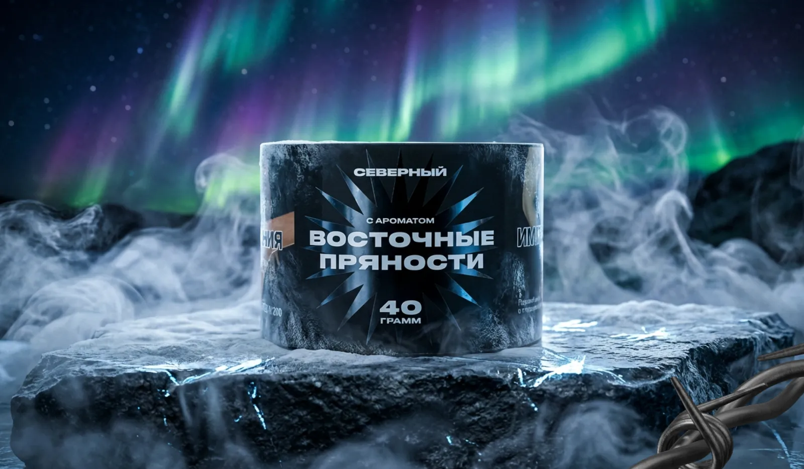
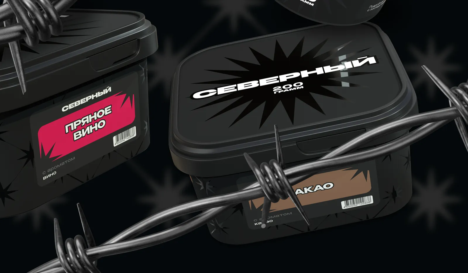
A packaging redesign — four concepts, from which one direction is chosen.
Illustrations with bold character and stylistic weight.
Nostalgia expressed through the fence motif — for the 25–35 audience.
A black northern star in noir — clean and austere.
Geometric abstraction with a brutalist-style pattern.
— Result
A more cohesive and grown-up visual language that holds the brand's spirit and works across the entire tin lineup.
— Next step · Free consultation
→ Book a slot · Telegram · MAX · Email — whatever's easiest
Telegram@stepan_abd MAXStepan Emailadbydad.agency@gmail.comA short first call — no decks, no fluff. We'll look at your site, social media or packaging, talk through the task and suggest where to start. No obligations on either side.