Brand and competitor analysis
We unpacked BLAXURY's positioning, character and ambitions, and studied the fashion and jewelry segment.
Branding · Logo & Identity
Jewelry brand BLAXURY needed a strong, modern identity free of luxury clichés. We bet on expressive typography and an image of “predatory elegance” — from the logo to the brand style, presentation and content.

Client
BLAXURY is a jewelry brand with a fashionable, confident attitude, where boldness and self-irony sit alongside a sense of taste and luxury.
The brand's visual language is built on character, typography and a feeling of living material — without excessive decoration.
The brand needed a logo that looks modern and strong, but without the usual luxury stamps — crowns, monograms and unnecessary decor.
And it had to strike a balance between boldness and elegance, staying expressive and versatile across digital, print and future applications.
— Gallery
 Logo variations
 Brand presentation
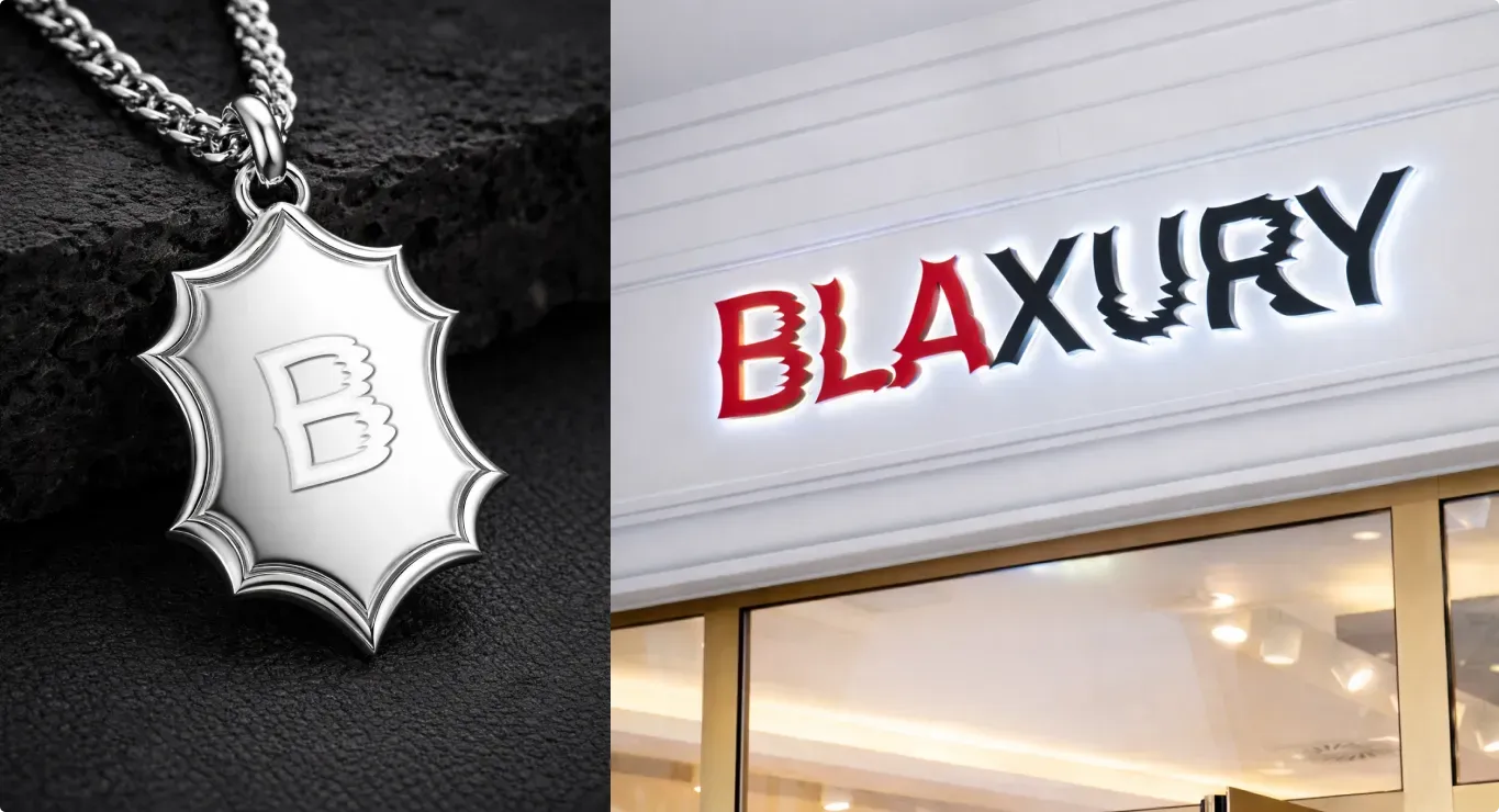 Pendant and signage
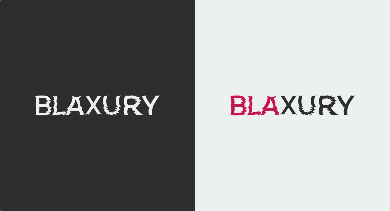 Brand presentation
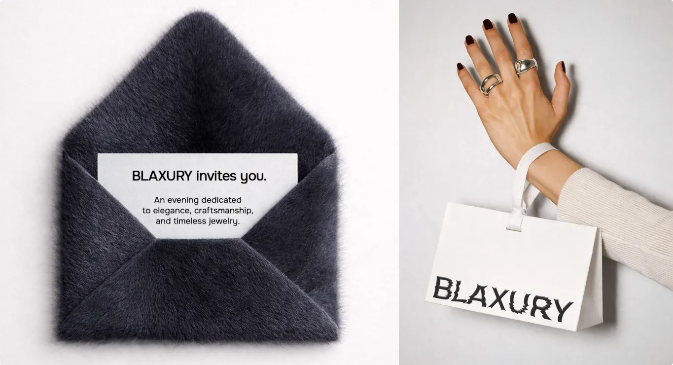 Guide: logo construction
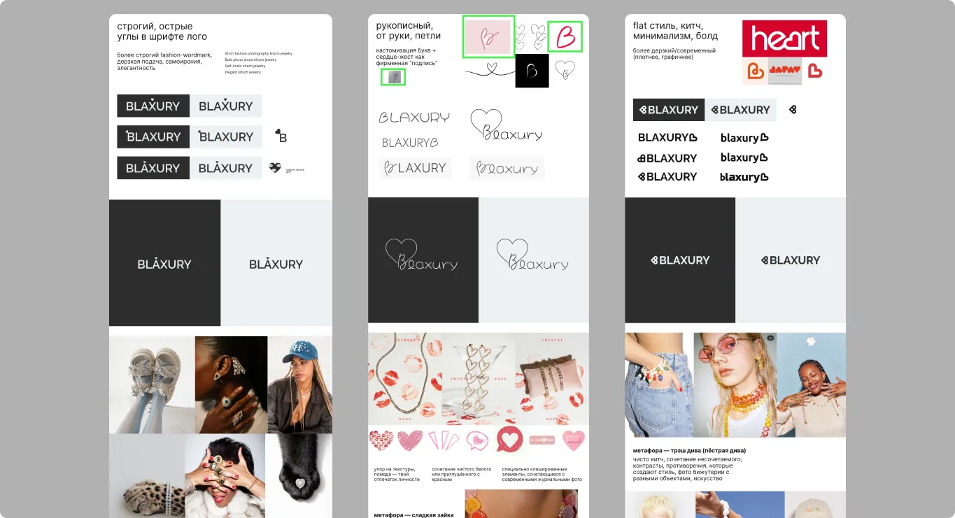 Logo in use
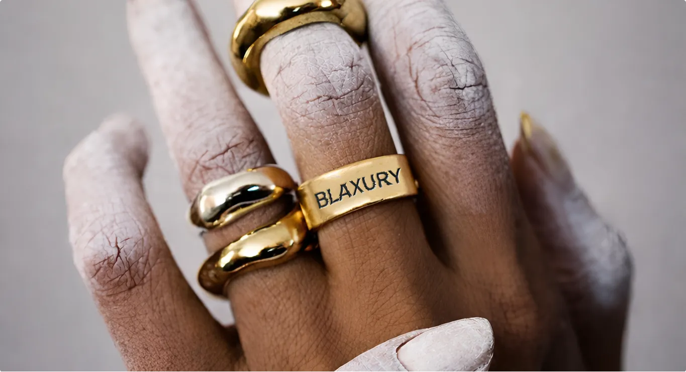 Identity in use
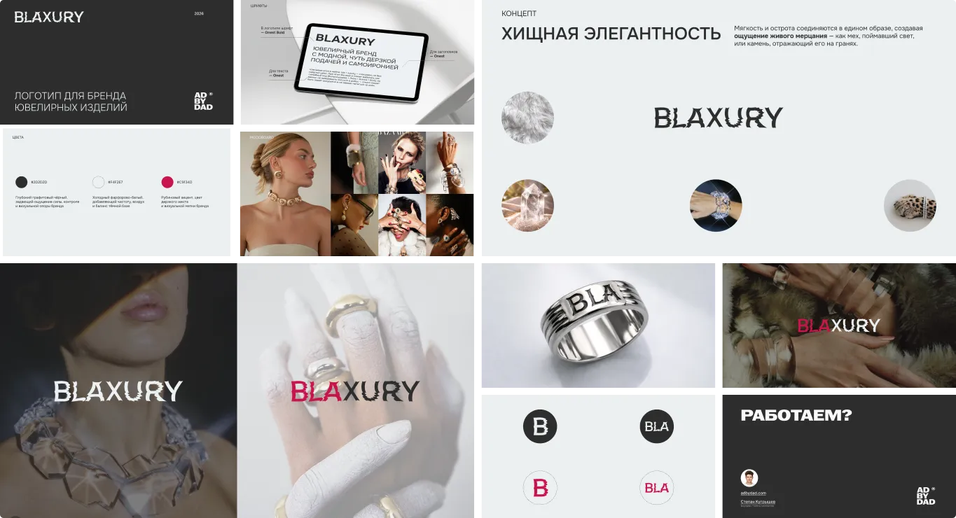 Brand applications
 Jewelry shoot
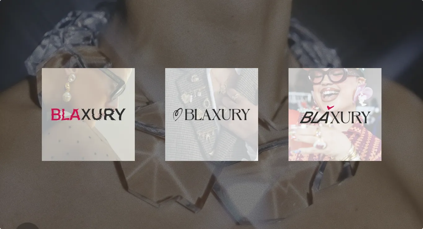 BLAXURY pendant
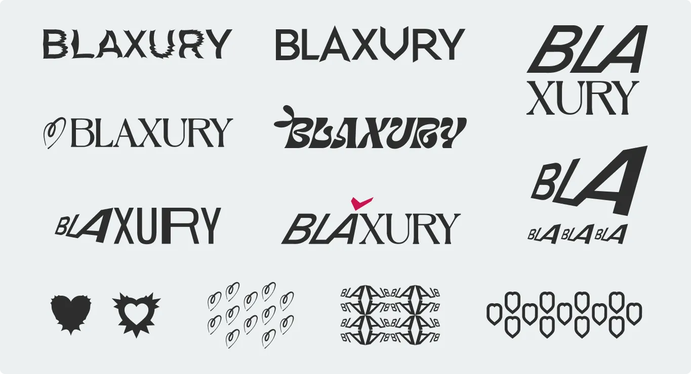 BLAXURY rings
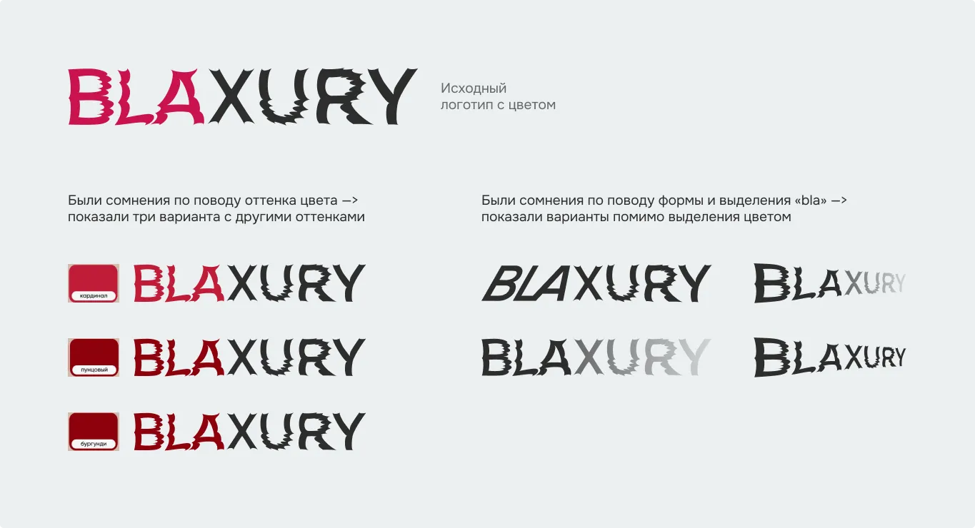 Product shoot
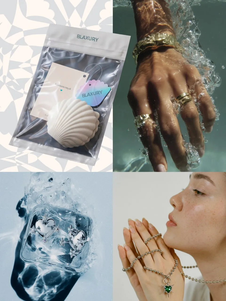 Jewelry shoot
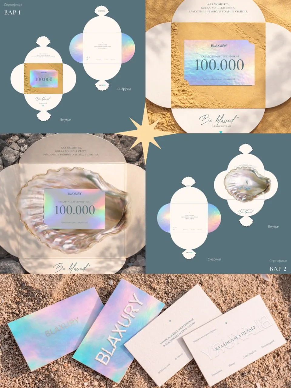 Brand visual
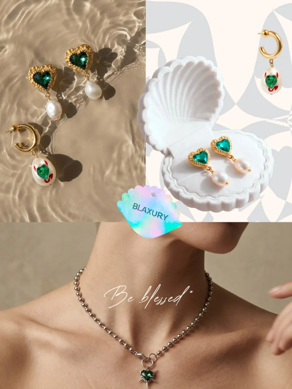 Brand applications
— ABD's role
We took the journey from segment analysis to a logo and a full identity — through three concepts and five stages.
We unpacked BLAXURY's positioning, character and ambitions, and studied the fashion and jewelry segment.
We gathered references and moodboards, researched typography and shaped three conceptual directions.
Predatory elegance, luxury kitsch and trash diva — three different logo moods to choose from.
The final direction — a contrast of softness and predatory strength, with a living, shimmering material effect.
The logo works as a standalone object without extra symbols; the heart-based idea was dropped in the final round.
On request, we prepared additional color and shape variations — but in the end the original concept won.
Beyond the logo, we developed the brand style and applications. After the logo was done, the visual style evolved under external influences — which is why the materials feature different palettes (from red to blue).
— Result
The final BLAXURY logo is an expressive typographic form with character and inner tension. The brand identity was built on its foundation; the style itself shifted after the logo under external influences — which is why the materials feature different palettes (from red to blue).
— Next step · Free consultation
→ Book a slot · Telegram · MAX · Email — whatever's easiest
Telegram@stepan_abd MAXStepan Emailadbydad.agency@gmail.comA short first call — no decks, no fluff. We'll look at your site, social media or packaging, talk through the task and suggest where to start. No obligations on either side.