
Packaging is the only advertising a customer holds in their hands at the exact moment of choosing. On a shelf or in a marketplace feed, it decides in a split second: pick it up or scroll past. In this article we'll break down why your business needs packaging design, how marketplace packaging differs, how the process unfolds stage by stage, what makes up the cost, and which trends work in 2026.
Why your business needs packaging design
Good packaging has three jobs, and all three are about money:
- Grab attention. Make the product stand out among dozens of neighbours in a fraction of a second.
- Explain. What it is, who it's for, why it's better — without reading fine print.
- Build trust. Neat packaging reads as a «quality product», sloppy packaging does the opposite — even if what's inside is excellent.
That's why it's more accurate to think of packaging not as a «wrapper» but as a silent salesperson: it works where there's no sales rep and no second chance at a first impression.
Marketplace packaging is its own story
On Wildberries and Ozon, packaging plays by different rules than on a store shelf. The customer first sees a tiny thumbnail in the feed, not a box in their hands. Hence the requirements:
- Legibility at thumbnail size. If a 200×200 pixel preview doesn't make clear what it is and whose it is, the product gets scrolled past. Small details and thin fonts don't work here.
- Line recognisability. When a brand has several flavours or variants, they should read as one family while still being easy to tell apart.
- Protection and logistics. Packaging has to survive the warehouse and delivery — a crumpled box kills the impression and breeds returns.
So «shelf» design and «marketplace» design are different tasks, and a good designer thinks about the thumbnail from the very start.
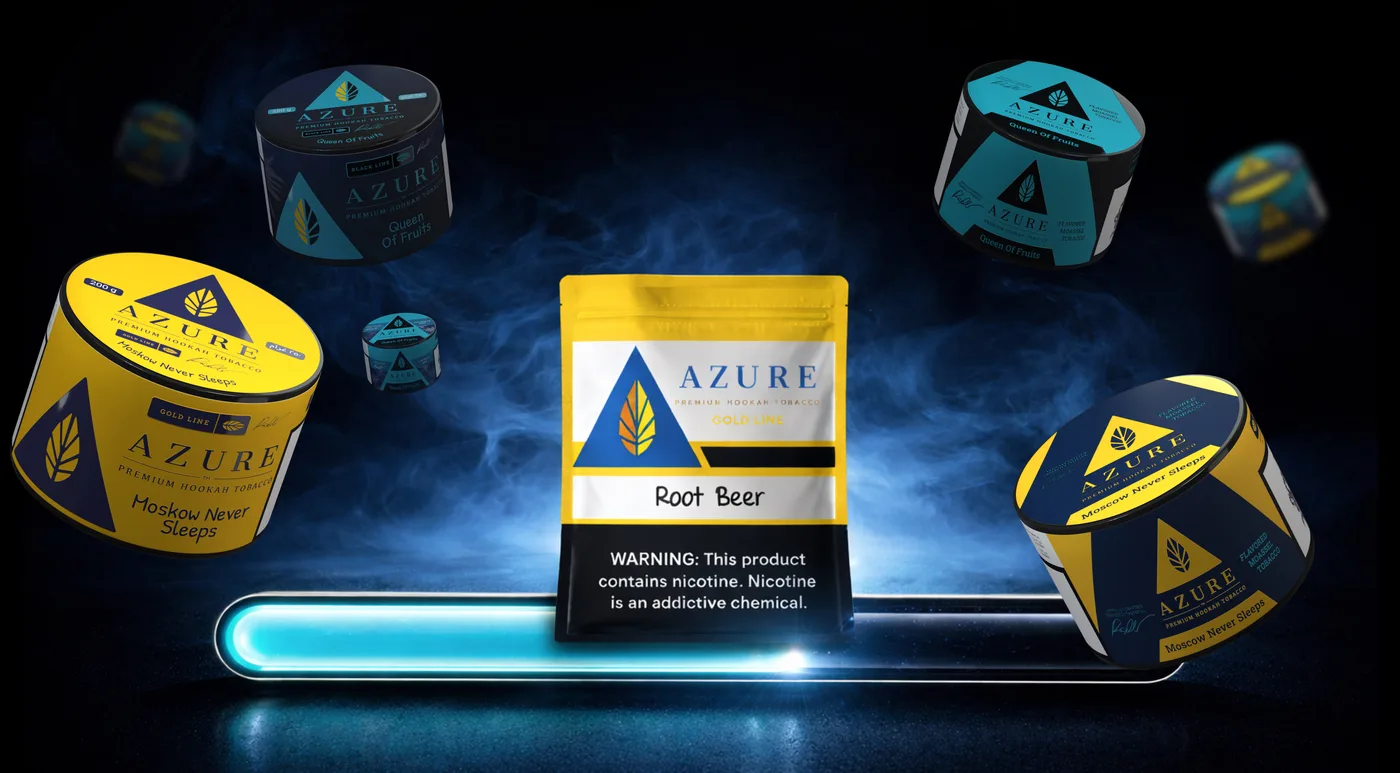 Case in pointAdapting Azure to a new format — the plastic jara new packaging format — from concept to print — see the case
How packaging design is developed: the stages
Proper development goes from the task to the solution, not «just make it pretty». Here are the stages:
1. Brief and analysis
What the product is, who the customer is, where they'll encounter it (shelf / marketplace / display), and what competitors look like. Also the technical inputs: type of packaging, material, shape, print budget.
2. Concept
The idea and visual direction: how the product will stand out and read. Not «the colour of the box», but the logic that shapes the whole line.
3. Design and product line
Rendering the layout, mapping it onto the actual packaging dieline, and working through every item in the line so they form a single family.
4. Testing in context and as a thumbnail
The layout is viewed in context: next to competitors, as a small thumbnail, on a 3D dieline. Many beautiful layouts fall apart exactly here — and that's fine, that's what testing is for.
5. Prepress and handoff to print
Preparing files for the specific printing house: colour profile (CMYK), bleeds, technical marks. A mistake at this step and the colour drifts on the run. That's why prepress matters no less than the design itself.
What makes up the cost of packaging design
Honestly: the range is wide, because «packaging design» can mean one box or a line of 20 items with prepress ready for print. The cost is driven by:
- The number of items in the line (a single SKU or dozens of flavours/variants).
- The depth of work — just the layout, or also concept, on-pack copywriting, prepress.
- The complexity of the construction and the printing house's requirements.
- Whether the brand identity is ready — if there's no brand yet, part of it gets built here.
Focus not on the price per layout but on the result: will the packaging sell, and will it survive print without surprises. A cheap layout that the printer rejects or that gets lost in the feed ends up costing more.
Packaging design trends 2026
Trends aren't a reason to follow blindly, but it's useful to know where the visual language is heading:
- Honest minimalism. Fewer embellishments, more clarity — what it is and why it's useful.
- Bold typography. The name and key message read even in a marketplace thumbnail.
- Sustainability as substance, not a sticker. Materials and messaging you can believe.
- Character over sterility. Packaging with the brand's tone is more memorable than «clean but bland».
The one rule above any trend: packaging must solve the sales task, not win a designers' contest.
New packaging design: when it's time for a redesign
A separate common request isn't «build from scratch» but «refresh what's already selling». A new packaging design is needed when:
- Sales stall on the shelf even though the product is good: it goes unnoticed or misunderstood among its neighbours.
- The line has grown haphazardly — new flavours were added «as you go», and the family no longer reads as one brand.
- The visuals feel dated next to refreshed competitors — the packaging has honestly served its time.
- The brand is repositioning — then the packaging is updated together with the whole system, which is already rebranding territory.
The key rule of a redesign: refresh without losing recognisability. Working packaging has accumulated equity — a colour, shape or element by which loyal customers find it on the shelf. A good new design keeps these anchors and cleans up everything else. And if the product lives on a bottle or a jar, the conversation starts with the label design — that has its own specifics.
Common mistakes
- Thinking about the shelf and forgetting the thumbnail — and losing in the marketplace feed.
- Overload. Ten messages on a box = zero read.
- An inconsistent line — the items don't read as one brand.
- Skimping on prepress — and colour drifting on the run.
Where to start
Not with «make the packaging prettier», but with «where will the customer see it and what will they compare it to». The answer sets everything else. If you'd like a sober outside look at your current packaging or an idea for a new line — it's free and commits you to nothing.